


Autocomplete
Vuero is integrated with Vue Multiselect, a vue 3 select single, multiple and tags input library. You can check the plugin documentation on Github. You can transform the component into an autocomplete by adding the :searchable="true" prop. Check the code example for more details.
Single Select
Vuero is integrated with Vue Multiselect, a vue 3 select single, multiple and tags input library. You can check the plugin documentation on Github. You can change the <Multiselect /> component radius by adding the is-curved or is-rounded class to the parent <VField /> component.
Options object
The <Multiselect /> component can receive data with his options props. You can either pass an Array or Object to the options props. You can also activate the multiple mode by setting the mode prop to mode="multiple".
Custom label
The <Multiselect /> component in multiple mode has a default label when you start selecting options. You can change the way the message is formatted by using the #multiplelabel custom slot to configure your message.
Disabled Option
<Multiselect /> options can be disabled. Simply pass a disabled property in your options object.
Tags Input
The <Multiselect /> component can be turned into a fully functional tags input component. In order to do that, set the mode prop to tags when instantiating the plugin. You can also enable search using the :searchable="true" prop and allow creation of new tags by using the :create-tag="true" prop.
Image Select
The <Multiselect /> component can be used with a custom template to show images for options and selected option. 2 CSS modifiers are available for images radius: is-curved and is-rounded.
 Javascript
 ReactJS
 VueJS
VueJS
- Javascript
- ReactJS
- VueJS
- Javascript
- ReactJS
- VueJS
Image with search
The <Multiselect /> component can be used with a custom template to show images for options and selected option. 2 CSS modifiers are available for images radius: is-curved and is-rounded.
- Javascript
- ReactJS
- VueJS
 Angular
 Android
 Html5
Html5 CSS3
CSS3
- Javascript
- ReactJS
- VueJS
- Angular
- Android
- Html5
- CSS3
- Javascript
- ReactJS
- VueJS
- Angular
- Android
- Html5
- CSS3
Users with search
The <Multiselect /> component can be used with a custom template to show images for options and selected option. 2 CSS modifiers are available for images radius: is-curved and is-rounded.
 Alice Carasca
 Erik Kovalsky
 Melany Wallace
 Tara Svenson
 Mary Lebowski
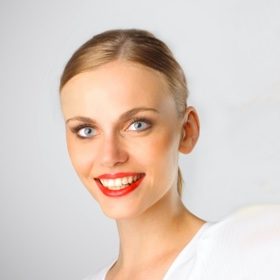 Irina Vierbovsky
 Jonathan Krugger
- Alice Carasca
- Erik Kovalsky
- Melany Wallace
- Tara Svenson
- Mary Lebowski
- Irina Vierbovsky
- Jonathan Krugger
- Alice Carasca
- Erik Kovalsky
- Melany Wallace
- Tara Svenson
- Mary Lebowski
- Irina Vierbovsky
- Jonathan Krugger
Icons with search
The <Multiselect /> component can be used with a custom template to show icons for options and selected option. Supports searching the values.
Image tags
You can combine the mode="tags" with a custom template. This way you can show custom tag elements with an image inside. The tag shape inherits from the select class modifier.
User tags
You can combine the mode="tags" with a custom template. This way you can show custom tag elements with an image inside. The tag shape inherits from the select class modifier.
Stacked images
You can combine the mode="tags" with a custom template. This way you can show custom tag elements with an image inside. The tag shape inherits from the select class modifier. Add the is-stacked class to the is-image-tags element to show stacked images.